Conceptual development has been one of the main skills that I have learnt throughout this module, from the responsive module I have learnt how valuable and important a concept is to any design work as it need to underline the entire bod of work. I have been developing this process of coming up with concept within the main what is good brief and within the smaller briefs. I have applied the skills from responsive and the studio sessions within this module to come up with a range of concepts for set briefs and then be analytical in the selection of the most appropriate and relevant concept.
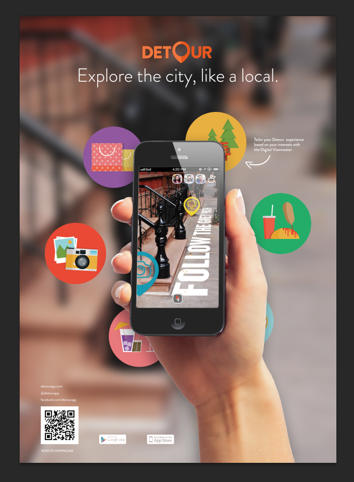
Within the module I have also chosen to focus more towards digital design, in particular focusing on user interface design and I have been developing those skills within the main what is good brief. After the initial concept development stage, my final concept involved developing an mobile application. With this in mind I have, from the beginning, been developing a set of skills which involve me working to a professional work through. For example developing brand guidelines and creating pixel perfect design that work on the iPhone screen. These new skills have been applied well as the iPhone mock up that I have created working perfectly on iPhone and is of the correct proportions, skills which I didn’t use or have in previous modules when I’ve designed for iPhone.
What approaches to/methods of design production have you developed and how have they informed your design development process? The main approach to design development that I used within the brief was producing a set of brand guidelines at the beginning of the brief which I then used as a guide for everything I designed and is something that would happen in a professional design studio and something I have been trying to emulate within the module. I helped greatly in ensuring continuity between everything that I was designing. I think the production of the research booklet was also a new approach to design production as I used my research booklet like my brand guidelines as a constant reference for the content of what I was designing for which meant I was designing relevant products for an appropriate auidence.
What strengths can you identify in your work and how have/will you capitalize on these?
The main skills which I have focusing on developing have been my digital design skills and these are skills which I hope to capitalize on during the summer I go on placement at a digital design studio. I have been working on developing a professional work flow which I can take forward with me as I begin to specialize in this area of design in the future.
Putting boards together is a skills that I have been developing since the start of my second year and is something I think I have got tremendously good at and is something that has been put into practice a lot within this modules briefs. Especially within the what is good brief in which I created 15 boards to demonstrate the final products and the application. Moving forward this will be a skills that I will carry with me into my future as a graphic designer as it’s an essential tool to my practice.
What weaknesses can you identify in your work and how will you address these in the future?
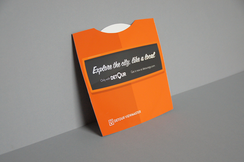
One weakness I can identity within my work is my range of print based products, I struggle make print a relevant format for my main what is good brief. The main concept was heavily digital focused and I found it difficult to find relevant and appropriate print based products that weren’t just being designed for the sake of having printed products. I overcame this by pushing my concept a little further and relating my concept to business. Print techniques however also lacked within the final printed products as again it simply wasn’t relevant to use them in the products I designed, however I have still developed skills in producing and outsourcing print jobs as well as working across print and digital, as the works in RGB whereas print is CYMK.
Identify five things that you will do differently next time and what do you expect to gain from doing these?
Attendance = 4
Punctuality = 5
Motivation = 5
Commitment = 5
Quantity of work produced = 4
Quality of work produced = 5
The main skills which I have focusing on developing have been my digital design skills and these are skills which I hope to capitalize on during the summer I go on placement at a digital design studio. I have been working on developing a professional work flow which I can take forward with me as I begin to specialize in this area of design in the future.
Putting boards together is a skills that I have been developing since the start of my second year and is something I think I have got tremendously good at and is something that has been put into practice a lot within this modules briefs. Especially within the what is good brief in which I created 15 boards to demonstrate the final products and the application. Moving forward this will be a skills that I will carry with me into my future as a graphic designer as it’s an essential tool to my practice.
What weaknesses can you identify in your work and how will you address these in the future?
One weakness I can identity within my work is my range of print based products, I struggle make print a relevant format for my main what is good brief. The main concept was heavily digital focused and I found it difficult to find relevant and appropriate print based products that weren’t just being designed for the sake of having printed products. I overcame this by pushing my concept a little further and relating my concept to business. Print techniques however also lacked within the final printed products as again it simply wasn’t relevant to use them in the products I designed, however I have still developed skills in producing and outsourcing print jobs as well as working across print and digital, as the works in RGB whereas print is CYMK.
Identify five things that you will do differently next time and what do you expect to gain from doing these?
- If I were to to do this brief again, time management would be the main aspect that I would aim to structure better, time management isn’t something I usually struggle with however within the module I haven’t dealt with it all to well as I’ve left a lot of until the end which is no way to work. If I had better time managed then this meant I would have had to push briefs further.
- I would leave myself time to learn After Effects, during the initial concept stages of the brief I proposed that I would make a video demonstration of the app but I had never worked with after effects before, I spent a few days trying to work with the software but couldn’t achieve the results I wanted so I had to abandoned that aspect of the brief.
- I would aim to experiment with more print techniques, as my brief was heavily digitally based it was hard for me to do this thought I did bring this aspect into the production of my research booklet instead. However I would still have liked to experiment with some new techniques.
- If I were redoing this brief I would probably want to push the concept even further and see where it could go in terms of being a brand experience rather than just an app and website and also push the business side of the application and how montization can inform features of the application.
- I would also plan for contingency time when outsourcing print jobs as I found out in within the what is good brief not everything always goes to plan and prints don’t always arrive when they say they should so time should be planned to allow for thing like this to happen and for them to be overcome.
Attendance = 4
Punctuality = 5
Motivation = 5
Commitment = 5
Quantity of work produced = 4
Quality of work produced = 5