Archives

Alphabet Soup/ Photoshop Development

I used Photoshop to aid the development process as well as working with no digital media, as it allowed me to quickly experiment with ideas and forms, which could then be translated to hand drawn designs.


Here the A is created from negative space, the A is formed from expanding area from the outer edges of the letters.


Condensing the serif's at the bottom of the letterform and expanding them at the top of the letterform to show expanse from smaller to larger.

Creating the concertina effect digitally allowed from greater accuracy and unified measurements, within this P I created a concertina across the whole of the letter from small to larger, However the concertina could expand across multiple letters which would more strongly convey the concept of Expand as it will expand over a larger distance.

Using the 'G' I expanding and blew up the top half of the G and left the remaining half of the G, to show how part of the letter had expanded and the other had not, leaving some of the letter original, it communicates what the letterform has expanded from.

Alphabet Soup/ Concertina M


To further progress the concertina idea, as I felt this was a strong idea which was was subtle in conveying expanse, I used paper to create an actual concertina using a letterform, I chose the letter M which i had previously drawn, I used the same concept of the individual concertina's becoming bigger as they move across the letter. However from this experiment it was clear that the rate in which the concertina grows needs to be slower as the M doesn't currently show a small to large growth, more concertina's closer together and growing slower would better help communicate this.

Alphabet Soup/ Development

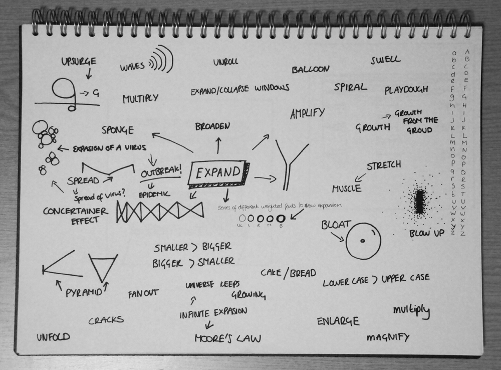
Here iI have explored a range of ideas, however the most effective idea is the movement within the K, gradually across a series of letterforms the elements of the K begin to move further apart, the letterform itself does not convey expanse, the space in which the K is moving communicates the idea the K is moving apart in a large space, much like the way space craft move in space.


I considered concept of a sugar cube dissipating into hot water could be used to communicate the idea of expanse, to visually communicate this i used a high density of dot around the sugar cube which gradually became less dense as the particles expand through the letter, however visually the idea shows movement, but does not communicate growth. I used a similar concept within the design of the 'I'. I also considered how expanding lines could be used to show expanse, I made the initial letter form small and allowed the lines to expand and exceed the dimensions of the letters, this conveyed expanse successfully.


Here I have explored a range of terms which convey expand, and tried to express them visually. The letterform 'P' expanding within the space of the box, the letter beginning confined and stopped from expanding further helps to communicate the visual message the letterform is growing and expanding. Using the letter 'P' i consider how a crack which starts small and and harmless develops into a larger developing crack expanding across the letterform. I also considered how perspective could be used to convey expanse and growth from small to big. Emerge was also a word I considered and how the letterform can grow from the being a 2D letterform into a 3D letterform. Using 'F' I again considered how increasing distances between lines could be used to convey expand.


I explored the idea of using radio waves to communicate expansion, as radio waves start from a central location and expand outwards, within the 'L' I kept the radio eaves a uniformed distance apart, however this didn't strongly communicate expand, as expand implies something getting bigger, then using 'X' i made the distant larger each time between the radio waves, this made the idea more obvious as it showed growth from something small to something large.


I Further developed the concept of using the concertina effect to create letterforms. Using Helvetica E, I used a wire frame concertina to fill out the letterform, starting with a very condensed cross which gradually become more open to show growing expanse.   However the idea initially translated well into a letterform, but as the crosses expanded and became more open it was less apparent what the lines were trying to create, therefore not communicating the concept of Expand clearly. To develop this idea further I considered how the a paper concertina would translate into a letterform, I experimented with the letter M for this idea as it has more unformed surface area horizontally, where as the E has large gaps which meant the vertical design of a concertina did not translate well into this letterform. The M worked extremely well at comunicsting Expand, as the paper conertina gradually became more open, the idea is subtle yet obvious, the letterform also works well as it shows movement - as expand is a movement.


Alphabet Soup/ Initial Ideas

Brief/ Produce a set, series or sequence of ten visual letterforms that explore and communicate your interpretation of a word selected from the randomiser.

To begin the initial thought process I explored other possible words which had a similar meaning to expand, many of these words helped to encourage the initial design thought process, for example the words bloat, pyramid and spread had immediate and obvious visual outcomes. To further the thought process i began to look at concepts and ideas which reflect the theme of expanse, such as the spread and outbreak of viruses, expansion of the universe, Moore's law and the concertina effect. These ideas lead to create letter forms inspired by these theories, seen above, an 'I' created using expanding particles, i also explored the possibility of how virus molecules could potentially create letterforms as well as concertina frame work being used to create a letterform. I then used this initial diagram to help with the flow of ideas as i continued to develop potential ideas. 


How To/ Resolution: Map + Front Cover


How To/ Progress Crit

Is the map an appropriate form of delivery? Yes
Is the design to complicated? (not clear)     No, somebody said they enjoyed seeing it
Do you think we have addressed our problem? Yes
Do the colours work well?  Yes, preferred over the colours from our initial map
Is the route clear?  Yes, they said road names would only add to confusion.

Action Plan:
  • Reduce size of icons
  • Add 'zzz' to sleepy man
  • Add Compass to bottom right of map 
  • Ask about possibility of digital printing on to matt paper to compliment visual style 
  • Add descriptions and key

How To/ Developing a Solution

As a group we decided to research a selection of maps to gather some ideas about the visual style we wanted for the map, a selection of maps which came from the website theydrawandtravel were popular amongst the group because of their simplistic style., which was either created digitally using simple illustrations or created through hand drawn illustrations, as a group we decided these maps worked well and were effective in conveying map information because of their use of a limited colour palette often between 3 and 5 colours, this helped to keep the maps simple and less aggressive on the eyes.As a group we worked together to create our own hand drawn elements for our map - which included illustrations for the obstacles and landmarks as well as the typography which was all hand drawn, we decided to do this as it was in keeping with the visual style. Initially we faced difficulties when choosing an appropriate colour palette for the map (See Map 1 Bellow) After a group discussion we decided that the current map was cluttered and the variance in colour made the map confusing and visually chaotic. We then decided we needed a more focused colour palette and chose 3 colours for the map, a light grey, a pastel red and a beige, these complimented each other well, with this colour scheme we used the pastel red and beige for the land marks and obstacles and the greg for the roads of the map. With this new colour scheme the map become more coherent and the visual style was much less choatic.


How To/ Initial Ideas

Our group was assigned the concept 'How to deal with the walk to college?' for the 'How To' brief, as a group we initially brainstormed idea's for possible responses and solutions to the brief. Most of the idea revolved around the idea of there being obstacles that prevent or make the journey to college more difficult, however as a group we took a light hearted approach to this idea. Most of the group quickly became popular with the map idea, in which we would create a map which details the directions to college which also features various obstacles you made encounter along the way. With this idea a clear favourite, we began to develop this idea further by discussing possible obstacles that could be included as well as possible visual style and media in which the final solution could be presented.


A Selection of Letters from Alphabet Soup

The alphabet i created in response to the summer brief, is based around the concept that each of the letters represents a different super hero which in turn reflects a characteristic of my personality, bellow is a selection of 5 from the alphabet


10 Common themes from Alphabet Soup

1) They are all different
2) Everyone used Photoshop at least once
3) Sketching was our starting point
4) All answered the full brief
5) Everyone picked Appropriate
6) Everyone started with research
7) Most used a scanner
8) Most are in baptisms
9) Most found certain letters a challenge (eg. U)
10) Most featured music as an element of the alphabet
 

Copyright 2011 All rights reserved