skip to main |
skip to sidebar
You Are Reading
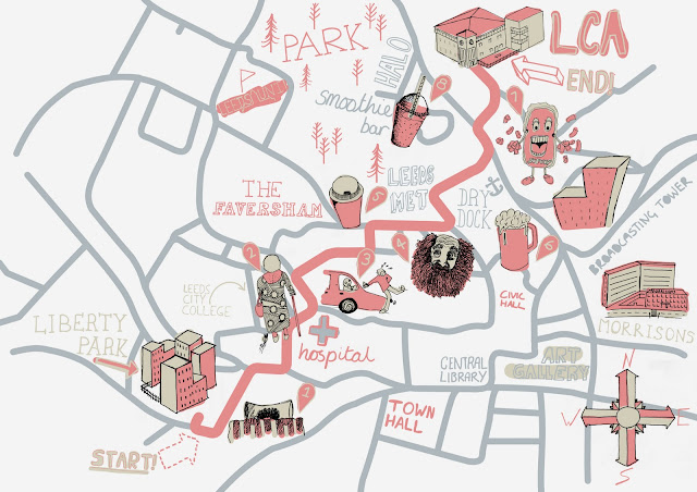
As a group we decided to research a selection of maps to gather some ideas about the visual style we wanted for the map, a selection of maps which came from the website theydrawandtravel were popular amongst the group because of their simplistic style., which was either created digitally using simple illustrations or created through hand drawn illustrations, as a group we decided these maps worked well and were effective in conveying map information because of their use of a limited colour palette often between 3 and 5 colours, this helped to keep the maps simple and less aggressive on the eyes.As a group we worked together to create our own hand drawn elements for our map - which included illustrations for the obstacles and landmarks as well as the typography which was all hand drawn, we decided to do this as it was in keeping with the visual style. Initially we faced difficulties when choosing an appropriate colour palette for the map (See Map 1 Bellow) After a group discussion we decided that the current map was cluttered and the variance in colour made the map confusing and visually chaotic. We then decided we needed a more focused colour palette and chose 3 colours for the map, a light grey, a pastel red and a beige, these complimented each other well, with this colour scheme we used the pastel red and beige for the land marks and obstacles and the greg for the roads of the map. With this new colour scheme the map become more coherent and the visual style was much less choatic.


Leave your comment