Archives

Design For Web: Cross Media


Design For Web: Website Screenshots


Design For Print & Web: Re-Written Brief 2


Design For Print & Web: What is 'Typical TV' Design?

I've hit a brick wall with my ISTD brief and stuck with the fact that the original brief says to stay away from 'typical' TV, yet the brief doesn't define what 'typical' design is. I have become stuck with this element of the brief as I feel like everything I'm doing has been done before. However Lorraine provided some insight into this, in that yes everything has been done before but it's about doing this in different ways and perhaps evoking new emotions in the target auidence. To to start to move forward with the brief I want to define and 'Typical' and what I don't want to do in this brief in hope this will enlighten me and provide some idea of what I do want to do with the brief.

Design For Print & Web: How to move forward with Channel X

Think about why channels have the colour they have? E4, purple and white targeted at a younger generation 18-30 whereas the old more 4 branding is black and green, which are the opposite to these colours and this channel is aimed at an older generation and has more informative and serious programming.

nothing is new and everything has been done before, but it's about doing things in new ways and evoking or familiar is certain cases in the auidence.

Define typical and list everything you don't want your TV channel design to do

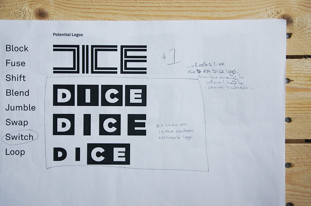
Make a sheet of possible names and then get rid of the ones you don't like, get a smaller list of possible names and see what you can do with them

Re write a more focused brief

What specific shows might the channel show, with a slight male bias, the channel is targeting a male auidence which doesn't rule our the female viewer, but a scenario maybe that the male picks the channel and the tv show which the female viewer then engages with an enjoys

Design For Print & Web: Progress Crit 1 Feedback


For this crit my work had progressed a considerable amount I had now developed a logo which worked across a range of variants and I had started to mock up how this would look on screen incorporating logos, images and text to form this. 

Strengths
  • A lot of visuals helps to understand where you are at and what you are aiming for. Strong concept using the qube as a base for designs. We can see a lot of logo development work
  • The tv type logo works in context and is spot on
Areas for improvement
  • Maybe having a colour scheme would help out the development of the logo further
  • Feedback on sheet (shown above) 
  • The logo is too big in some places where you have placed it in context
  • Maybe consider using CNTRL as a name
Considerations
  • Look like youtube logo, reminds me of youtube although I do like it
  • Where will auidence come into contact with the work
  • Product, range and distribution 
Moving Forward
  • I need to fully ensure the logo is original and is best communicating the concept of the channel 
  • Consider starting to work with colour scheme to see further how the logo is working on a contextual basis
  • Confirm if this is defiantly the name I want to use - 'Qube'


Design For Print & Web: Progress Crit 1 Boards


Since the first concept crit based on the feedback I've moved quite a bit forward with the project. Since the name dice and logo were very generic and many of them looked very similar to existing logos for existing companies. I've changed the name to 'Qube' which I now think is a much stronger name. The name qube works on many levels within the brands ethos. Qube works in terms of channel's content which provides variety because there are many sides to a qube which is similar to how the channel offer different variety of shows and it also works in terms the different genres of programming that the channel shows. The term qube also translates into how the channels functions visually as the visual aesthetic of the channel is based on a rubics qube. The way the channel looks visually is based on the 9 cubes that feature on the side of the rubics qube. The tv screen is split into 9 rectangles which is where the channel information is placed such as the logo, upcoming shows. 

Design For Print & Web: Concept Crit

In the concept crit I presented this rough idea which is an example of how the channel with function on screen and how content could be displayed, however this is in the very early stages and needs a lot of development, but the idea of working the visuals around how a rubics cube works was liked by those in my crit.


The progress crit was extremely helpful as it gave me feedback at a stage I needed, as I'm at the stage of developing the concept it's crucial I get this right and having input from other will help identify any flaws in my ideas. I presented a two boards with logo ideas and names and also a sheet of research as well several design sheets. The main feedback I received was that many of the I have designed already existed or similar variants of the logo were already out there. However it was said that my idea behind the channel of offering choice and variety was a ethos to start developing a name around. At this point I haven't decided on a name but I am heavily considering Dice, this got mixed reviews in the crit but at this stage it's hard to say as a concept needs to be based around it so more work needs developing in this area. Switch was also a name suggested a by a few people in the crit as being something that I could potentially call the channel. 


Design For Print & Web: Concept Pitch


For the concept the area I wanted to focus on is getting some sort of name together or even a selection of names together that I am considering, this is where I began! After reading the brief, I developed an idea of what they required the channel to be and combined this with what I also wanted to do with the channel and this meant that I started to develop an ethos for the channel and this came in the form of the channel providing mixture, variety, choice and control to it's auidence. A range of names stemmed from these words and their meaning such as dice. Out the names I currently I'm seriously considering Dice as this implies the choice and variety offered by the channel but we'll see what happens in the crit. I moved this name over to design a couple of logos that could potentially work with the name. I didn't have a lot of time to think these through but they have potential to be developed. I have also started to look at what existing channels that are competing with my channel's content, what they're visual style looks like as this brief will involve a lot of visual research to ensure i'm being innovative in my TV design so it's not typical. 

Design For Print & Web: Re-written Brief


Design For Print & Web: Selecting A Brief

Lorraine ran a studio session to help us figure out which brief would be best for us to pick and continued ahead with, after choosing a brief we were asked a series of questions which all required 5 answers and sometimes these answers were in the form of more question. I gained a lot out of workshop as it helped me to get rid of all the jargon and pointless english that was complicating the brief and to bare bones of what the brief is asking me to do! I have chosen the Channel X brief and subsequently raised and answered these questions....


Design For Print & Web: 3 Briefs


Copyright 2011 All rights reserved