Archives

Anatomy of Type 3/ Typeface Weights


Proverbially Yours 1/ Final Poster Series

I have chosen to photograph my posters within the context of a primary school classroom, I believe the posters relate to this audience in that school will relate to the tongue twister and understand that it is wrong and mixed up, furthermore the message of the proverb is something children should understand and follow, as often for children they will not be perfect at something first time, but with time and practice they will eventually become perfect at something, 

Proverbially Yours 1/ Testing Ideas

I have developed this idea further as sometime conveying message in the simplistic, often childlike way can be effective in delivering the message. The idea is simple, the colours are bold and contrast well making the poster high impact. Furthermore the irregularity and confusion created in the first poster contrasted but the neat perfection of the second poster, I think makes the posters clear even from a distant, the idea is conveyed clearly and doesn't require the audience to think about the message that is being delivered. 

Moving the idea of the darts board as a action that needs to be practiced, I have tested this idea of target practice, which I feel is more clear and less complicated, the red also stands out against the black and the difference between the two images is clear, the idea shows both repetition and the development of perfection, the posters work together in showing this. However the subject matter of the idea maybe perhaps a little controversial and not the best way of showing the proverb to the public as the design does have negative connotations. 

Using Adobe illustrator to visual the the evolution of the wheel, I have considered how the wheel has developed throughout the ages, here perhaps the message has become overcomplicated and confused, the idea needs simplify to become high impact and clear. However the colours work well and the visuals are clear but the idea is not. 

Here I have explored the use of different weights within a typeface to create meaning, the repetition of proverb itself signifies how you must practice and repeat an action before it is perfect. However by using a lighter weight and juxtaposing this with a heavier weight suggests that practice and repetition (lighter weight) ultimately leads to perfect (heavier weight)

Using Adobe illustrator as a tool to quickly test and develop ideas, I used the type tool to explore the different ways in which errors could be shown within type to symbolise how practicing needs to take place before the perfect type is created. Having the lines through individual letters is clear and legible way to signify a mistake in the type, adding the correction also strengthens this idea. Having the strike through the whole word suggest practice but no hint of perfection, therefore this idea isn't as strong in being high impact and clear. 

Proverbially Yours 1/ Developing Ideas

Within my initial ideas I considered how the wheel had initially been made by many different shapes and different materials before the perfect circular wheel had been created. Within my initial idea I showed this through drawing wheels in the shape of triangles and squares before crafting the perfect circular wheel, however I felt this visual representation was slightly too simple and perhaps childlike. Therefore within this developed idea I have visualised a more accurate timeline of the wheels history before it was perfect. I think this is a strong idea as it shows how many had to practice making the perfect wheel before it was actually created many years later. The type only poster also conveys this sense of progression and movement towards perfection shown through the improving use of type from cave like type to a sans-serif typeface of modernism. I think the idea works well, however the posters may convey more of an idea of evolution rather than the idea of practising something to make it perfect. In contrast I have focused on a childlike idea, which is that children have to practice and learn to put the shapes in the right slot, within this idea the posters work as a series as they are in context with each other and tell a story between them. Although it works well, it doesn't show the core idea of repetition and practicing. 

The flipping of a pancake is something that everybody understand needs to be practiced before it is perfect, perfection is something that little people achieve if at all, which is mirrored in the flipping of a pancake in that not many people can successfully do it, the posters show how the failed flipping a pancake can after practice lead to the perfect flip of a pancake, to further improve the visuals however more focused needs to be placed on repeating the flipping of the pancake before perfection is achieved. The type poster however work very well in 'practice' being the pancake that is flipped and leaves 'makes perfect' to land in the pan but upside down, the positioning of the type mirrors the action shown in the other two posters. 
Similarly to the principles behind the wheel idea, the evolution of the iPod is a clever visual that show how apple have practiced and eventually perfected the digital media player, I also think that the iPod resonates with society as it is easily recognisable and high impact, therefore makes a good stimuli for the posters. The timeline and the gradual but not drastic change in the iPod development shows how repetition creates perfection over time, which is what my proverb is about. 

Within my initial ideas I explored how a tongue twister is something that has to be practiced to be perfected, this idea works extremely well for the type only poster, how it doesn't have visuals associated with it. Therefore for the other poster I created visuals to repeat a tongue twister, a mouth in which the tongue turns into a twister, which leads the eye to a shell the subject matter of the tongue twister. I think the posters work well as a series. The layout of the type and the use of different weights makes the message clear and understandable. 
Furthermore I also considered the obvious stimuli of sports as sports are a process and action that must be practiced to become better at. I choose to focus on darts as this allowed for simplistic visualisation, in that the image only poster leads onto the final poster repetition and act of playing darts is visualised within these posters. This makes for a strong visual representation of Practice make Perfect as the practising of the sport can be seen within the poster. However the type poster needs more development as it is weak in comparison and doesn't link to the other posters. 

Proverbially Yours 1/ Initial Ideas


To initially explore the possibilities in conveying my proverb of 'Practice make perfect' through type, image and image and type I drafted 15 initial concepts and ideas. For the type only poster I began to consider pre exisiting types of practicing through type, such as spelling errors and also the repetition of the proverb to convey the practice in practice makes perfect. When designing the image and type and image poster I considered them as a pair and how they could work both on there own and together, or how the image could follow onto the type and image poster. Using them as a pair allowed me to show change and difference across two poster to convey the proverb. 

Alphabet Soup Typeface/ Crit

The brief involved designing a typeface for another persons character and personality, therefore for this critique, within medium sized groups all of the alphabets were placed on a wall with each partners next to each other vertically. Then as pairs each person was asked to discussed what they thought the designed for them was saying about there personality. This then lead to group discussion about how successful the work had been. 

I felt the typeface that had been designed for me used many elements of my personality and character and they were easily identifiable and other elements which were only revealed after examining the typeface. The typeface I designed for my partner David received mostly positive feedback and David felt it convey a part of his character simply and effectively. It was also noted that the typeface worked better with colour as the name demonstrated the typefaces being used with colour and it was very effective. The typeface worked well as a whole, however from the crit it was evident the letterform O needed more work, as when viewing the typeface from a distance it became apparent that it didn't fit with the rest of the typeface and didn't convey the shy yet distinctive side to David's personality. 

Summary: Develop the letterform O to fit more effectible within the typeface and consider how the letterform can be used to show David's shy yet distinctive characteristics like the other letterforms. 


Anatomy of Type 3/ Naming Typefaces

Brick Serif Extra Bold

Wave Serif UltraBold Extended

Tri-Pointer Gothic Bold

Smooth Diamond Regular Italic

Transforming Tale Regular

Anatomy of Type 2/ Creating New Letterforms

Using the 10 different letterforms at 5 varying sizes I created 5 new, origional and unique letterforms from the anatomical parts of the other letterforms, mixing parts of lower case and upper case letter forms as well using parts of the different sized letterforms. 


Anatomy of Type 1/ Resizing Letterforms

Using existing 10 letterforms (5 uppercase letters and 5 lower case letters of the same letter) I resized each of the letterforms into 5 sizes - X-Small (1cm x 1cm), Small (3cm x 3cm), Medium (5cm x 5cm), Large (7cm x 7cm) and X-Large (10cm x 10cm)


Alphabet Soup Typeface/ Using The Typeface


To further understand how the Typeface can be used in context, and it's effectiveness as a typeface I have created some examples showing the how the typeface could be potentially used. the typeface works well, the words are legible and clear however some letterforms such as the N break the continuity within the typeface as the N work on a different baseline therefore slightly hindering the legibility of the whole word. 

Alphabet Soup Typeface/ Final Typeface & Name Badge


The stark contrast between the pin thin stroke of half of the letterform and the heavy, bold weighting of the other half of the letterform works extremely well. The clear contrast conveys simply the change in david's character. The thin line being symbolic of a shyness, and almost conveys a sense of weakness which is bold contrasted with the thicker line which suggests David's full of life, enjoyable personality. The typeface also works well when used with colour as seen in the name badge, it's legible, bold and unique. Some letterforms however are still more successful than other, for example the A,B and D work consistently well however the O as a letterform singularly doesn't have the same characteristics and doesn't convey such a bold contrast. 


Alphabet Soup Typeface/ Developing The Final Typeface


After my progression crit I was advised to move forward with this idea that is based on different line/stroke weights and also develops from a smaller letterform into a larger letterform. I decided to also add serifs to the typeface as this allowed for greater scope when choosing which parts of the anatomy of the type would be thicker or thinner. After developing the initial set of letterforms, I still felt that some where more successful than other I therefore reworked some of the letterforms to makes sure they all worked individually and as a typeface effectively.  

Alphabet Soup Typeface/ Idea Development


Within this idea I explored the relationship between the weight of lines within the letterform which made up the letterform. Each of letterforms starts with a thiner weight which then develops into a stronger bolder weighted line. The idea visualises the shyness of David's character symbolised by the thin stroke which is then contrasted with the thick bolder stroke to signify David's character once you get to know him. This idea is effect in showing the change and contrast in david's personality. Certain letterforms work well such as the A and B however other letterform struggle to follow the symbolism of growth and change such as the letterforms O and T. 

These selection of ideas are based on 'hide and seek' which is a similar concept to what i'm trying to convey within my typeface, in that david hides his personality when you first meet him but then as you seek out his personality he changes and becomes a different person. The letterforms are based on the shapes your finger make when you cover your eyes while playing hide and seek, I have incorporated this finger visualises into the anatomy of the letterform. Within the other ideas I have explored how the eyes could be peeking through the letterform to symbolise how character is there you just have to work harder to see it. Also I have looked at the contrast between straight and wavy line strokes to create the letterforms. The wavy lines akin to david's initial timid exterior which then transforms into a stronger, more confident character. 

To further develop the letterforms that didn't work as well within the initial idea of using different weighted stroke within the letterforms, here I have explored different ways in crafting the letterform which weren't very successful. The letterforms C and G now work much better in that size of the letterform grows and extends. 

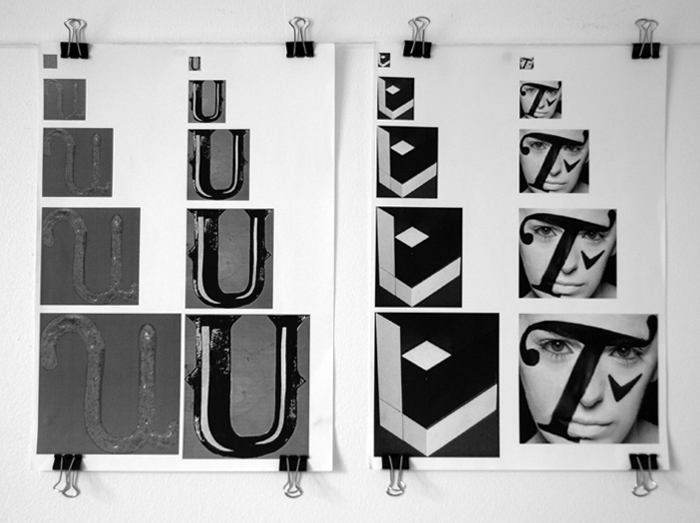
Within these ideas I have explored how the stroke/outline of the letterform could be manipulated to convey the change in David's character. The first series of letterforms looks at how a wavy, irregular line develops into a straight, smooth line to symbolise the journey and change in personality over time. Similarly with the series bellow a dashed/dotted line starts the letterform initially but then changes into a solid line to suggest the fragmented personality initially by then david's true character. Within the final series the contrast in smaller and larger letterform being combined shows the change and also the difference. The gap with between within half of the letterform may also suggest time and how he changes with time. Although these ideas work well in showing the development in his personality as letterforms when used at different scales wouldn't work very effectively, the stroke would become distorted.

I also used Photoshop as a development tool to explore ideas, within this ideas I have used a simple shape of a square to craft each letter form. The square signify the simple, quite side to david's character and the small lines being used to create bowls and other anatomy of the type to show how david initially only shows a little bit of his true personality, the letterforms work well however they don't show a change of development in character which is a key part of my statement of intent. 

Again I have used Photoshop as a tool for idea development, this idea crafts the letterform from a line which continually grows in weight to signify joinery in getting to know david's true character. The line weight starts at nothing, a point. and then develops into a thick, heavy stroke. Although the letterform works well, the visual aesthetic of the letterform I don't feel convey's david's character as it's sharp and angular, which doesn't reflect david's personality. 
This idea is based on the the shape that is made my the point of a speech bubble that is often shown coming from the mouth, I choose to use this shape because of it's links to conversation but also the shape shows growth from a small point into a larger shape which felt david's personality. 

For each of the letterforms within this typeface a square has been used, a simple and bland shape which is similar to how quite and shy david is when you first meet him, however the smaller circles within the typeface which created the bowls and other anatomy of the type suggest and reflect the elements of david's personality that come out in small doses as you begin to talk to him. However I feel the typeface is not that clear as the circles are quite small, to perhaps move this idea for the circles could be made larger to make more of an impact against the square.

Alphabet Soup Typeface/ Statement of Intent

After conducting the interview with David I chose 5 words which I thought best reflected David's character and personality, I chose these words because they appeared more than once within the interview or I felt they had promise for strong visual development. Using these five words I explored alternative and similar words which would help the design design process. By conducting this process this allowed me to focus on typeface on specific criteria of David's personality, I derived my statement of intent from these words.


Statement of intent: I intend to create a typeface that represents David's shyness when you first meet him and the gradual growth of his character as you get to know him.


Alphabet Soup Typeface/ Interview with David Gaskell

To develop a better understanding of David and to learn more about him before designing a typeface based on his character we both interviewed each other against a predetermined set of questions. Although the questions were varied we felt we didn't learn much about each others character. So after answering the preset questions which give me such knowledge as david's favourite saying being 'Kabash' and worst fear being homelessness, we decided to ask each other more interesting questions such as music taste, favourite movies and hobbies to gain a greater and more detailed understanding of David's personality. From the interview areas I feel I could focus on are transport, throughout the questions many of David's answer revolved around some sort of transport, for example, he hates people lack of manners whilst driving, hates public transport in general, he has a commonality to fall asleep on the train and is everyday life involves taking the journey from Manchester to Leeds to attend university. However what intrigued me the most about David's persona was that when we first engaged in the interview David was very shy and quite however by the end of the interview he became an interesting, talkative and upbeat character. This stark contrast in how you first perceive David and how that perception of David changes as you learn more about him is a key feature of his personality. 


Areas of potential focus for the typeface:

  • Initial shyness which leads to David's true talkative and interesting character 
  • Transport 
  • Passion for Electric Industrial Rock
  • His favourite phrase 'Kabash' 
  • Love of the 60's and specifically the late 60's 

Alphabet Soup Crit

Within this crit all of the groups work were placed into groups of the same word, for example all of the typefaces conveys expand were placed together, as groups we then critiqued another groups work anonymously. As pairs within the groups we first discussed the work generally we then devised a serious of 5 criteria by which to judge the successfulness of the work, then looking at the body of letterforms created and viewing them as individual letterforms and not sets or series a process of elimination then began as we used to the criteria to remove any work that did not fulfil that criteria until the group of letterforms was narrowed down to 5 final letterforms. 

The work that I created in response to this brief worked as two series of 5 and for the letterforms to convey 'expand' they needed to be viewed as a set, therefore when my work was looked at by other as individual letterforms they didn't necessarily convey 'expand' without being in context of the other letterforms. From this crit process I have developed a greater understanding about how work can only be deemed successful against certain criteria, it is these criteria that define how successful a piece of work is. Although my work was eliminated early in the elimination of process because it didn't meet the criteria by which it was begging judged however this doesn't deem the work unsuccessful - only unsuccessful by certain criteria.

Summary: Work is deemed successful against a set criteria, which will be defined by those looking at the work

Alphabet Soup/ Final Letterforms Conveying 'Expand'


The final 10 letterforms I created consisted of two sets of 5 letterforms, which as sets convey the word 'expand'. I picked the two strongest ideas from the range of ideas I explored throughout the development and exploration process. The first series of letterforms is based on a crack which begins small and gradually begins to expand and enlarge across the five letterforms, during the creation of these letterforms I was also exploring how much of the letterform could be removed yet the letter still be legible. I feel that as a series all the letterforms are legible, as the in context with each other, however the final letterform of the first series could be confused with other letterforms such as the letter F. The second series of letterforms I created focused on the concertina effect I explored throughout my development. Again the letterforms convey 'expand' when seen as a series and are in context with each other, as the concertina expands and grows across the five letterforms. The first letterform works extremely well both singularly and within context of the other letterforms, however the later letterforms of the series are visually similar and the change is subtle which isn't always immediately noticeable. 


Copyright 2011 All rights reserved