Common Feedback
Within today's studio sessions the group was separated into small groups of 5 and 6 in which we then split into pairs to crit the work of others within our group, however I worked alone to crit the work of others. Using the feedback form to evaluate the strengths and weaknesses of the work being presented. For I found common things that worked within the work I looked at and this was the stock worked well for the type of packaging and the stock also complimented the aesthetic design of the packaging, especially the colours choices made worked with the stock choice. However overall areas for improvement I found common within the work of others was the positioning of the logo on the packaging and how the positioning affects the packaging when you're actually interacting with it.
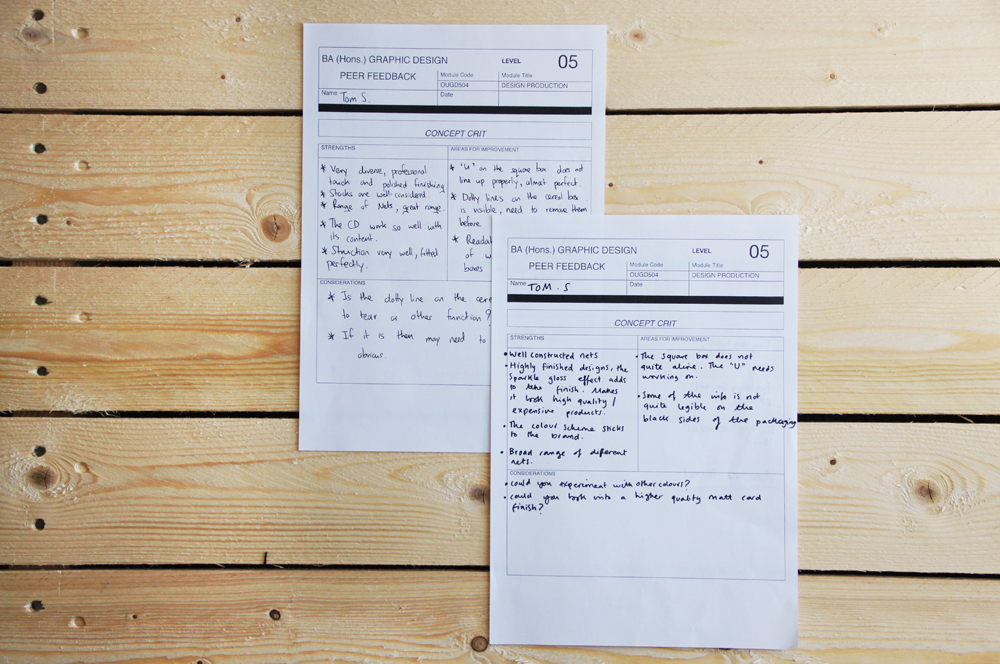
My personal feedback
Strengths:
- Very diverse collection of packaging nets used
- Finished to a professional quality, a polished finish
- Good range of nets
- The CD works well with it's contents
- Constructed well, and fit together well as nets
- Well constructed nets
- Sparkle gloss affect makes the finish more professional, of a high quality, suggests a more expensive product
- Colour scheme sticks to the brands well
- Broad range of different nets
Weaknesses:
- The design of the square box does not quote align the 'U' needs re positioning
- Some of the information is not legible on the packaging, where the white type is positioned on the black background
- Again 'U' needs repositioning on the box, complete that professional look and feel
- Dotted lines on cereal box, are they needed? Could they be removed before printing or printed on the reverse
- Readability and legibility of the website address across all of the packaging could be improved
Considerations:
- Consider printing the net on the reverse of the packaging so that structural marks are not seen within the final product.
- However if these lines are needed make it more obvious what they are needed for
- Could you experiment with a variety of colours, rather than just the black and white?
- Could look into using a even higher quality stock to compliment the use of the high quality finish on the type?
Moving Forward?
- One thing I need to consider doing within my design practice is testing things and making sure they work before I create the final item, for example within this piece of work the text (website addresses) printed legibly however once the finish was applied over the top, legibility was sacrificed, If i had tested the affects of the finish first on the text i could have increased the weight of the type before printing. Therefore in the future, where appropriate I will text new techniques and experiments before applying them to my final products.
- When trying to achieve a high quality finish, makes sure all elements of the packaging will achieve this quality, as having some elements well made like the finish, elements not aligning correctly can weakness the finish of the overall product. Moving forward ensure that the product is completely at the best quality it can be.
Leave your comment