Archives

Studio Workshop: Introduction to Web Design


The Purpose of website:
  • Promotion
  • Information
  • Persuasion
  • Contact
  • Supplementary to this - Entertainment 

THE AUDIENCE IS NEVER EVERYONE

Three key elements to a good website:
  • Is it functional?
  • Is it visually appealing?
  • Is the functionality useable? 

-

Designing a portfolio website
  • Homepage: Name, Job Title, Selected samples of work, Navigation
  • Work: examples of work in the form of image or videos, projects descriptions and titles
  • Information: CV, work experience, Academic background, summary of who I am, Awards, exhibitions
  • Contact: Email address, phone number, Possible location, Network links (Twitter, Facebook, Tumblr)

Feedback received:
  • Simple easy to understand layout
  • Maybe have name and title larger to make it more noticeable
  • How is the homepage eye catching?
  • Something to encourage users to browse other pages?
  • Design is a little plain?
  • In the footer there are 4 pages, but there are three in the header, unify this to avoid confusion! 
  • Simple and clean, does the job
  • Good use of the footer, simple and limited use of text
  • The footer suits the layout of the page
  • Would you need the footer as well as the link to the contact
  • Good detailed plan, would like to see a more interesting design
  • Simple yet effective layout

Common Feedback from group web design challenge:
  • Clean layout and easy to use but unoriginal
  • Navigation is simple and clear
  • Redundant Features
  • KISS (Keep It Simple, Stupid!)
  • Use of the grid to aid design on paper and then taking it to digital

Study Task 2: What is Colour for Print?

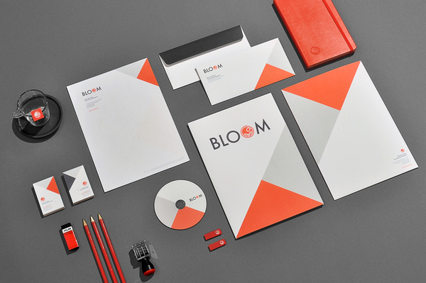
Branding & Identity

Use of CYMK


Use of Monochrome


Use of Spot Colours


Packaging
Use of CYMK


Use of Monochrome


Use of Spot  Colour


Publishing
Use of CYMK


Use of Monochrome


Use of Spot Colour


Wayfinding and Information Graphics
Use of CYMK


Use of Monochrome


Use of Spot Colour


Studio Workshop: The Good vs. The Bad of Web Design

Type Workshop: Adobe Caslon Pro


Identifying Print Methods and Colour Processes

Offset Lithography, 3 Colours

Risograph, 2 Colours

Offset Lithography, 3 Colours

Flexography, 3 Colours

Offset Lithography, 2 Colours

Offset Lithography, Full Colour CMYK

Flexography, 2 Colours

Digital Print, 1 Colour

CSI: Graphic Design

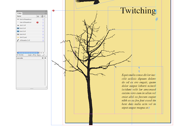
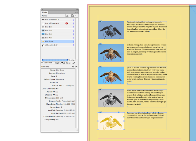
Missing Link
This would be fixed by emailed the client and asking them for the original file so it can be relinked within the indesign document. Alternatively the document could be sent back to the client for them to relink the document themselves. 

RGB Colour space used in image
RGB colour space has been used within the image which means the colour will not accurately be represented as they are on screen when they are printed. To fix this the image would need to be reopened within Photoshop and changed to CYMK colour space and then re-saved, the document may automatically update within indesign, if not the document link will need relinking or refreshing. 

Background colour not extending into the bleed
The background colour on the first page does not extend across the edge of the actual page size therefore when printing the document may have a slight white line where the page has been cut down and the printed page is not 100% accurate. To fix this the box containing the yellow colour needs to be resized to extend across the edge of the pages actual size. 

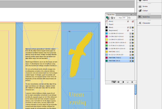
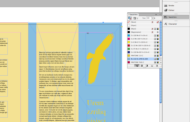
Selected blue is an RGB colour space colour
To fix this problem the client will need to select another colour that can be found within the CMYK colour space as currently the chosen blue is part of the RGB colour space and will not accurately be represented in print. 
Two unused Pantone colours appear in the swatches panel
Two unused colour swatches are still listed within the colour palette although this causes no problems to the digital design, the set up of the commercial printers may mean that additional blank aluminium or cooper printing plates are produced which subsequently costs money. To fix this the unused pantone swatches need to be delete from the swatches menu.

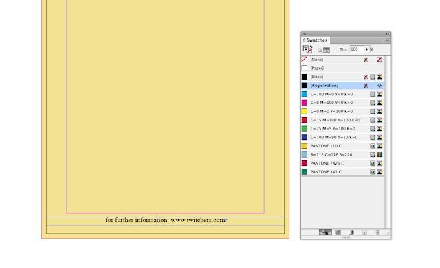
Registration colour used on text which should be black
Registration black which is used for the printing of registration marks and not for elements within the actual printed document, here registration black has been applied to a piece of type within the document. To fix this the type must be selected and the colour will need to be changed by highlighting the type and changing black from the swatches menu.

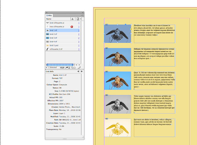
Image size is large has been resized smaller
A large image has been imported directly into indesign and has been resized to the correct size although this may cause no problems to resolution of the image it can cause problems when printing as the software has to do extra work in scaling down the image before printing which can cause the computer software to crash or become unresponsive. To fix this the image needs to be opened within Photoshop, resized to the correct size to be used in the actual indesign document and the saved and relinked within the indesign document. 

Image is 72 ppi
The image resolution of one image has been set and saved at 72 ppi, this image quality is to low for printing and will cause the image to become pixelated or of a lesser quality when printed. To fix this he ppi of the image needs to be increased within photoshop to the standard of ppi, however the original image must be used to do this and not done by scaling up the 72 ppi version of the image as this will also result in inferior quality when the ppi is increased. 

Common Web Elements


Good Web Design

I love the simplicity of this website, you can't go wrong with black and white, it's makes the site clear and easy to navigate and makes you focus on the important content which is the images. However I think the vertical text is a little hard to read and not really needed. 
NB again has taken a simple approach to its website, I think the left aligned sidebar creates a structure and allows for you to easily navigate the site. The images placed within the grid allow you systematically look through the images. 

The 2xElliot interface is one of my favourites, I feel like the navigation it's there I don't notice it, I focus purely on the work but the navigation is simple and easy when I need to find other links to navigate around the rest of the websites. I terms of being a portfolio websites it works really well and the work is primary focus as soon as you load the site. 

Again this site has allowed the content to dictate the main functionality of the website and the interface be used in a practical and functional sense rather than to create an aesthetic this helps when as it doesn't distract from the work/content. 

One of my favourite studios and a good functioning websites. Again making using of the minimal black and white colour scheme. The different sized images create a some variety within the page but is still functional and viewable. The sizing of the image also allows the you focus on specific pieces of work, perhaps works more important as chosen by the studio. 


Copyright 2011 All rights reserved