The brief allowed for the use of one of the CYM colours and also black, however opacities are allowed, I used the blend tool to explore how expanse could be conveying using opacities of colour. I tested this with each of the colours and felt the yellow was the most effective in showing an expanse from a bright vivid colour to pale almost white colour.
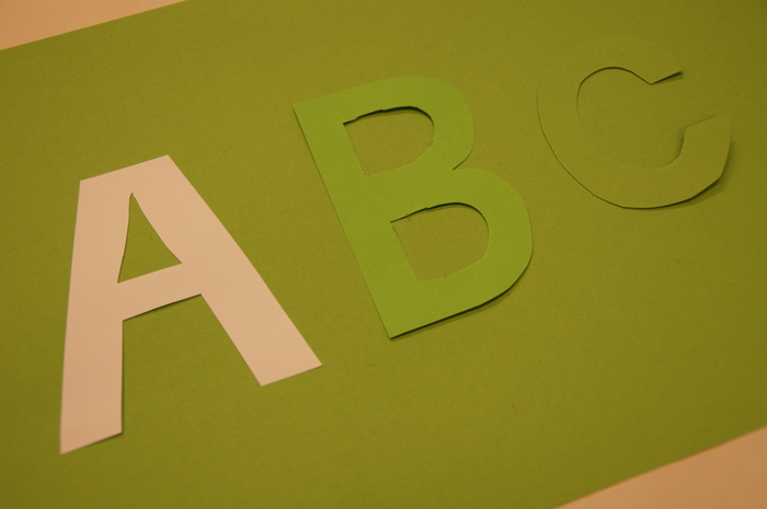
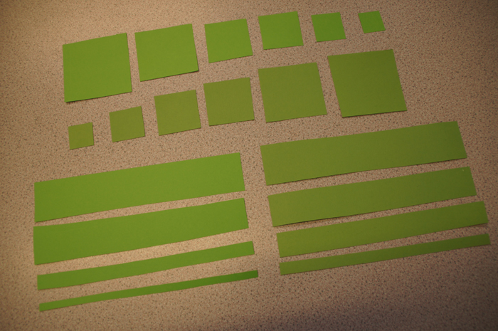
Using the rectangle tool I created a series of vertical lines that gradually grew in size from 1mm increasing in size by 1 mm each time, this made a successful letterform within the letter B as the B's anatomy has a solid stroke to start the letterform, however for letterforms such as A the idea did not translate as well as the thinner strokes could not be seen within the letterform, a the A letterform starts from a point. This idea would perhaps work better if the first stroke started at 5 mm rather than as thin as 1mm.


I also explored how expanse could be shown from a central point and burst outwards rather than expanding either horizontally or vertically. I considered how this idea would translate into letterforms such as H and M however the idea is not as strong when placed within a letterform and looses the context of expanding from a central point. To test how this could be fixed or potentially work better I tried rotating the expanding line to angle of the letterform, this was more successful however it still created a confusing letterform which would potentially be make a uneven typeface as a whole.
Another experiment I tested was to expands the lines outside of the surface area of the letterform, although it works well as a legible letterform it doesn't strongly convey expanse which is what I wanted my typeface to do. I feel this design conveys 'fluctuation' an increase and decrease rather than expand.