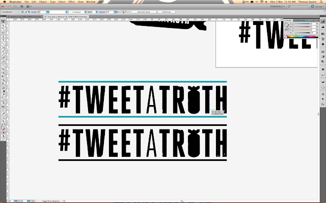
As a group once we had all gone away individually to design a range of logo we came together and presented out logo ideas to each other, from that we selected what we thought was the best designs and combined these ideas for logo, colour scheme and font choice together to create one identity for the campaign. Using a computer we all gather around together to sort through the logos, select the elements we liked and merged them together to create something we were all happy with, working in this way ensured all of the group were happy and also we had created a logo that was effective as it took the best elements of many different logo designs. We decided to choose a colour that was close to the colours used by twitter as this will create an association between our campaign and twitter amongst our audience. So both the hashtag and the colours used will communicate our campaign is about twitter.


Leave your comment