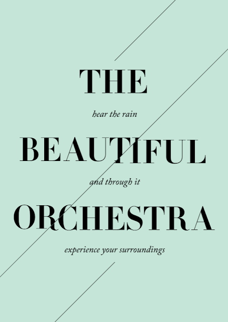
Having decided to use this phrase, beautiful orchestra, I have been experimenting with 'A' of 'The' visually the 'The' works better within the composition of the poster and with the portrait format using 'The' makes the poster less bottom heavy and more evenly weighted. Furthermore 'A' refers to s single event whereas 'The' could imply multiple instances, as rain happens everywhere and at different times.
The word rain is positioned at the top of the poster to create the context for the poster, as without it the poster does not convey the message is about rain. I have also experimented with a larger A however I think it looks out of place.
I felt the further definition was needed to further convey and inform the message I am making, therefore I have added this subtext which can be read at a closer distance to the poster which explains the message read on the poster from a distance, this may make the need for the word rain redundant?
My ideas have been based around using line and shape to convey rain rather using traditional imagery such as the rain drop to visual convey rain. Furthermore as I am using primarily typography to create the design, I want these visual elements to interact with the type. Here I have used the line a symbol for falling rain, the rain is falling to create the typographical forms.
Within these experiments I have taken theory from modernism and going back to basic of visual communication, people perceive rain in a rain drop shape however I have simplified this into a circle and experimented with how this circle can affect the typography by overlaying the circle and adjusting layer styles. The contrasting colours work well however the sub text is less legible and rain doesn't tend to affect colours, it often masks the world like the droplets placed over the typography with the opacity lowered acts more like rain.
I wanted to explore the format and how this can be used as rain is something that is everywhere and not confined to one place or area, I have left the type bleed off the format of the page to suggest the scale of rain and how even when captured using photography rain is also cropped into the format of the image.
I have further developed the line a metaphor for rain, I have explored how the line can cut through the type like rain cuts through the air and the environment. Both variants works well however when the line is broken up the subtext is more legible and readable.
Within other designs I have been experimenting with the distortion of Typography, I have experimented with this idea here as well. The line of rain distorts the type where is cuts through the type, similarity to how rain distorts our view of the world. The type has still remained legible the design is less clean.


Leave your comment