The brief stated to select a colour from a series of colour provided and use this colour as a staring point into an investigation into photoshop and how the tools the software offers can manipulate images. I choose green as the colour I am going to focus on, I created this mind map which suggests a range of areas greens relates to and potential imagery that could be used on the postcards.
An idea that I experimented within in Photoshop was taking a famous member of the public that had made considerable movement with issues such as Al Gore, using the posterize filter combined with overlaying single colours of green I was able to create this design, however I don't feel it strongly convey a green message.
Starting out with the initial image, I desaturated the image which made the image black and white as it removed all colour saturation, Then using a new layer I filled it with a green and adjusted the layer properties/style to allow the black and white image to show through but with a tint of green. This design more strongly convey greens and draws your eye into the type as it contrast bold against the vivid green.
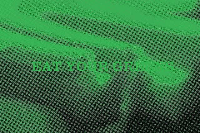
Using another feature of Photoshop I used one of the image applied a filter to that image referred to as colour halftone, this make the image out of a series of small dots, to make this dots only black the image must be set to grey scale. Although the affect created is bold, simple and vivid the type is unreadable which reduces the effectiveness of the design. I tested this effect with two different colour palettes however both proved to make the type unreadable therefore the design may not translate well across other images.


Leave your comment