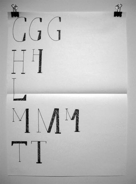
After my progression crit I was advised to move forward with this idea that is based on different line/stroke weights and also develops from a smaller letterform into a larger letterform. I decided to also add serifs to the typeface as this allowed for greater scope when choosing which parts of the anatomy of the type would be thicker or thinner. After developing the initial set of letterforms, I still felt that some where more successful than other I therefore reworked some of the letterforms to makes sure they all worked individually and as a typeface effectively.


Leave your comment